With increasing awareness of the visual differences associated with dyslexia and the high incidence of dyslexia in the general population (15-20%), the world seems poised to change how they present print to dyslexic readers. What fonts are best for dyslexic readers affects the overall readability of texts and there for speed, accuracy and potentially persistence of the reader. Children are known to find larger fonts easier to read than smaller ones, and as a group, dyslexic readers are more likely to read words by shape than non-dyslexic ones, making certain fonts more readable.
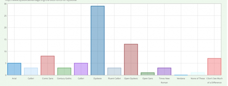
The winners were: Dyslexie, Open Dyslexic, and Comic Sans!
Now the tricky part is that Dyslexie has a default font size that is a little larger than the rest. Also there were some interesting comments from participants. One person said that while her son voted for Dyslexie as the easier font to read, he also skipped words. It may be that certain fonts are better for reading quickly (less crowding effects, more shape cues), but that may also lead to lower accuracy. Anyway – remember what is best for you is what is the most important. Individual variations and preferences may be physiologic!
Dyslexic Advantage is an Amazon Affiliate. If you click on a link that takes you to the Amazon store, Dyslexic Advantage may earn money on qualifying purchases. Clicking HERE to enter Amazon and making a purchase may support Dyslexic Advantage. Thank you!