 Do you find it easier to read webpages that aren’t cluttered? If so, you’re not alone.
Popups and even photos can be distracting. Many browser reading modes offer customizations like font size, color, and sometimes character and line spacing. Typically, many dyslexic children and adults prefer slight increases in default font size, slight increases in character spacing, and double line spacing between paragraphs.
After having their Reader Mode hidden for years, Google launched it officially in March, making it available on Google Chrome and Chromebooks. Here is how it works:
Lifehacker has a helpful article on How to use Reader View for how to access Reader View on Safari, Firefox, and Microsoft’s Immersive Reader.
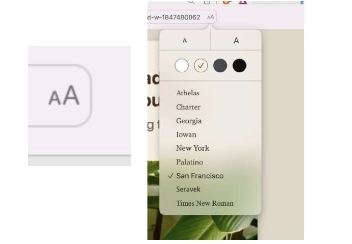
For example, on Safari, there is a tiny page icon near the URL or web address or link area.

If you click on that, it will open up a tiny AA to the right of the web address and it’s there you can adjust font size, font, and background color. Once you set it, it your preferences will always be shown on Reader Mode.
If you thought there was a separate app or extension to declutter like this – there are – the preferences were so popular that companies started including as part of their standard browsers…they just may be a little difficult to find if you don’t know about them.

