

Despite the fact that dyslexics are over-represented in Art & Design, the field of User Design is surprisingly late to designing for dyslexia specifically in mind.
It may be that some design is as good as it is because there are already dyslexics in design teams leading the dominant tech companies such as Apple, Microsoft, and Google. However, we also know that many of these highly successful people keep a low profile about their dyslexia, and our hope is that these individuals should come forward and educate members of their teams as well as fellow executives in order to help technology be an even great gift to the worldwide dyslexia community.
Members of the Dyslexic Advantage community have done their part participating in research and focus groups with the hope of helping design better tools and interfaces for everyone.
Recently Andrew Zusman published a review (HERE) of general design principles helpful for dyslexics. Some of you may remember that you helped Andrew out by giving him helpful feedback about optimal design principles for dyslexics…so we have YOU to thank for some of these changes and principles that will help guide future designers.
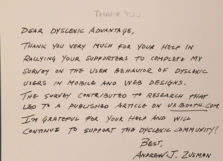
Here’s the thank you card that Andrew sent us:
 ]
]
ANDREW’S TAKE-HOME POINTS (from the article)
1. Dyslexia affects people differently.
2. Dyslexia has its advantages.
3. There isn’t a one-solution-fits-all. “Where one user might favor clear typography, another prefers reassurance in a checkout process.”
4. Try a sans serif font. Consider Open Dyslexic or Dyslexie.
5. Use narrower text columns. Avoid justified text with its variable word spacing.
6. Avoid high contrast colors.
7. Incorporate text to speech tools whenever possible.
8. Use a logical pattern of navigation whenever possible with an accessible Home page on every page.